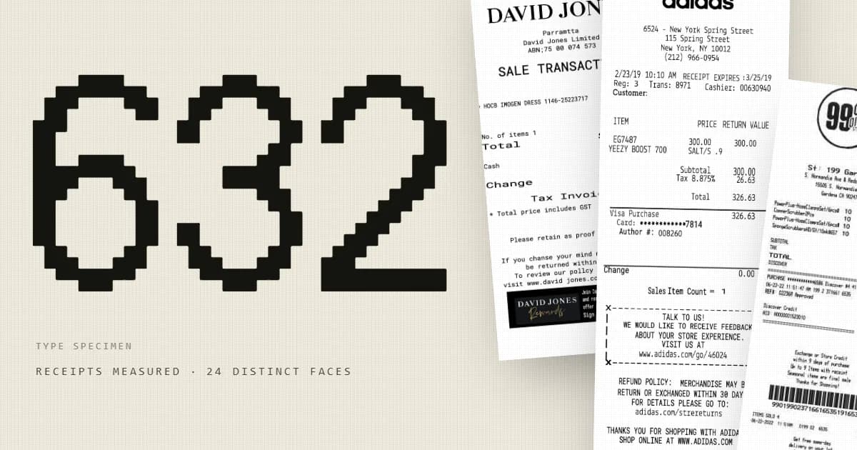
What fonts are on receipts? We measured 632
Receipts all look alike. We measured 632 redrawn from real documents: 24 typeface families, 176 combinations — and the most-used face isn't one you read.
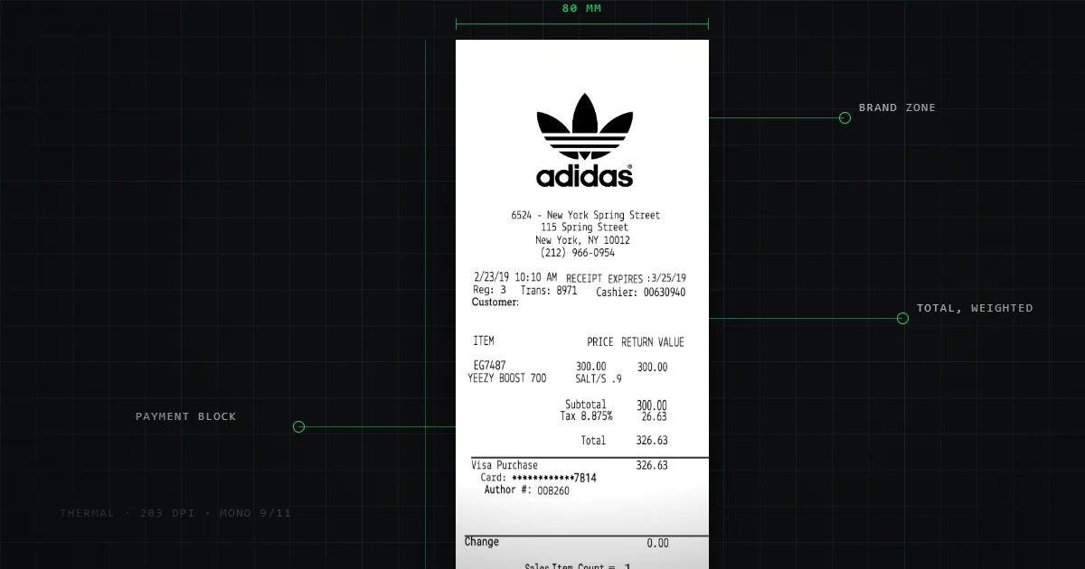
Every receipt looks like every other receipt. Narrow paper, cramped monospace, a row of dashes, a barcode at the bottom. The uniformity is so complete that it's easy to assume there is essentially one receipt font, sitting in the ROM of every thermal printer in the world.
We were in a position to check. Our template library is built by redrawing real receipts — 632 of them — and every redraw records which typefaces it uses and at what sizes. So we counted.
The short answer: 24 distinct typeface families, appearing in 176 different combinations, across 545 distinct type-size ranges. And the single most-used face on a receipt is not one you're meant to read.
What we measured, and what we didn't
Some honesty about the dataset, because it changes how you should read the numbers.
These are redrawn receipts. Each one is a rebuild of a real document, matched to the original as closely as the rebuild allows. That means the fonts here are the typefaces chosen to reproduce receipts, not a dump of the ROM fonts inside the printers that produced the originals. Where a printer used a built-in bitmap face, the redraw approximates it with the closest available web font.
So this is a good answer to "what does receipt typography look like, and how much does it vary?" It is not a survey of POS printer firmware.
We also deliberately measured only structure — typeface names, type sizes, element types and counts, canvas dimensions. We did not read the contents of any text field. Receipts redrawn from real documents contain real transaction data — masked card digits, authorisation codes, addresses — and none of that belongs in a blog post. Every figure below is an aggregate.
All figures were measured on 18 August 2026 against a library of 632 templates. We re-run the query before publishing changes to this article, because the library grows and stale statistics are worse than none.
The headline numbers
| Templates measured | 632 |
| Distinct typeface families | 24 |
| Distinct family combinations | 176 |
| Distinct type-size ranges | 545 |
| Mean elements per receipt | 21.1 |
The interesting number is 176. If receipts were as uniform as they look, you'd expect a handful of combinations covering nearly everything. Instead, 632 receipts produce 176 distinct typeface pairings — roughly one new combination for every three and a half receipts.
The 545 distinct size ranges say the same thing more sharply. A "size range" is the span from the smallest to the largest type on a given receipt. There are almost as many distinct spans as there are receipts. Receipts are visually uniform at a glance and quite variable in detail.
The most common typeface isn't for reading
Here are the twelve most common families, by the share of receipts they appear on:
| Typeface | Share of receipts |
|---|---|
| Libre Barcode 39 | 35.1% |
| Thermal Receipt1 | 31.3% |
| Arvo | 23.9% |
| Thermal Receipt2 | 16.1% |
| Lekton | 14.6% |
| Open Sans | 11.1% |
| Roboto | 9.3% |
| B612 Mono | 7.8% |
| Nanum Gothic Coding | 6.5% |
| Roboto Mono | 6.0% |
| Raleway | 6.0% |
| ThermalReceipt2 | 4.7% |
The most-used face on a receipt is Libre Barcode 39 — a font whose glyphs are barcode bars. It's on 35.1% of receipts and nobody has ever read a word of it. Barcodes are usually drawn as type rather than as images, which is why a "font" tops a font ranking.
Below that the picture is what you'd expect and then isn't. Two purpose-built faces named for the job — Thermal Receipt1 and Thermal Receipt2 — cover a combined 47.4%. But third place goes to Arvo, a slab serif, on nearly a quarter of all receipts. Slab serifs read as chunky and deliberate; they're a plausible stand-in for the heavy, slightly blobby output of a worn thermal head.
Then a long tail of general-purpose web fonts — Open Sans, Roboto, Raleway — and a cluster of monospaced faces: Lekton, B612 Mono, Nanum Gothic Coding, Roboto Mono.
One data-hygiene note, since it's visible in that table: "Thermal Receipt2" and "ThermalReceipt2" are the same face under two spellings. We count 24 distinct family strings; the number of distinct typefaces is slightly lower. We'd rather show you that than quietly merge it.
Why monospace, and why not always
The reason receipts lean monospaced is structural, not aesthetic. A receipt is a two-column layout — description on the left, amount on the right — printed by a device with no layout engine. Fixed-pitch type means the right-hand column lands in the same place on every line without anyone computing a position. It's column alignment achieved by choosing a font.
That constraint also explains the sizes. Thermal print heads at 80mm have a fixed dot pitch, so type has to sit on that grid to stay crisp. Most POS printers expose two built-in faces — commonly called Font A and Font B, roughly 12×24 and 9×17 dots in Epson's ESC/POS command reference, the instruction set most receipt printers implement — and switching between them is how a receipt gets emphasis, since there's no bold in the usual sense. Banking and ticketing often use OCR-B, standardised as ISO 1073-2 and designed to be read by machines as well as people.
But nearly half our sample uses something that isn't monospaced at all. Logos, store names, headers and marketing footers are set in proportional faces, which is why Open Sans, Roboto and Raleway show up. The monospace constraint applies to the tabular middle of a receipt, not to its top and bottom.
What the size ranges say about legibility
545 distinct size ranges across 632 receipts is more variation than the uniform-looking output suggests. It falls out of the same structure: a receipt has a large store name, a body set as small as legibility allows, and a total that needs to be findable at a glance. Three tiers, and each design resolves them slightly differently.
The practical floor is set by the paper and the print head, not by taste. Go too small on 80mm thermal and the dot grid stops resolving the counters in letters like e and a; go too large and a receipt that should be 15cm becomes 40cm, which costs real money in paper across a year of transactions.
What else is on a receipt
While measuring type we also counted elements. Across 632 receipts:
| Element | Total occurrences |
|---|---|
| Text fields | 11,284 |
| Dividers | 1,194 |
| Logos | 364 |
| Barcodes | 248 |
| Date-and-time stamps | 124 |
| Images | 87 |
| Phone numbers | 37 |
And by share of receipts: 52.8% carry a logo, 37.3% carry a barcode, and 0.0% carry a QR code. Not one receipt in 632.
That last figure surprised us most. QR codes feel ubiquitous — on menus, posters, packaging — but across this sample they had not reached the printed receipt at all. The barcode, a technology from the 1970s, is on more than a third of them. Whatever is driving QR adoption elsewhere had not, at the time these documents were captured, reached the till roll. We go into what the barcode is actually for in the layout piece.
How tall is a receipt, really?
Three times its width, at the median. But the spread is wider than the stereotype suggests — measuring height against width across all 632:
| Proportion | Share |
|---|---|
| Wide slip (under 1.4:1) | 2.1% |
| Short slip (1.4–2.2:1) | 11.7% |
| The usual tall receipt (2.2–3.2:1) | 63.8% |
| Long till roll (3.2–4.5:1) | 17.6% |
| Very long roll (4.5:1 and over) | 4.9% |
The median is exactly 3.00 — three times as tall as it is wide. The extremes run from 0.36 (wider than it is tall, closer to a card than a roll) to 6.30.
If you're designing a receipt
The measurements point at a few things worth carrying into a design:
Set the tabular section in a monospaced face and let fixed pitch do your column alignment. It's the reason receipts look the way they do.
You don't have to set everything in it. Nearly half our sample uses a proportional face for the header and footer. The constraint is on the columns.
Design to three tiers of size, not a continuum: store name, body, total.
Budget your length. At a 3:1 median, every line you add costs paper on every transaction you ever process.
Don't assume you need a QR code because everything else has one. Nothing in this sample had one.
We've written the layout side up separately in how receipts are actually designed.
The data
The aggregate figures in this article — family counts, combination counts, size ranges, element distributions and proportion bands — are free to reuse with attribution and a link back. We're happy to share the underlying aggregate tables — get in touch.
What we won't publish, and won't share, is anything derived from the contents of the receipts themselves. That data came from real transactions and stays where it is.