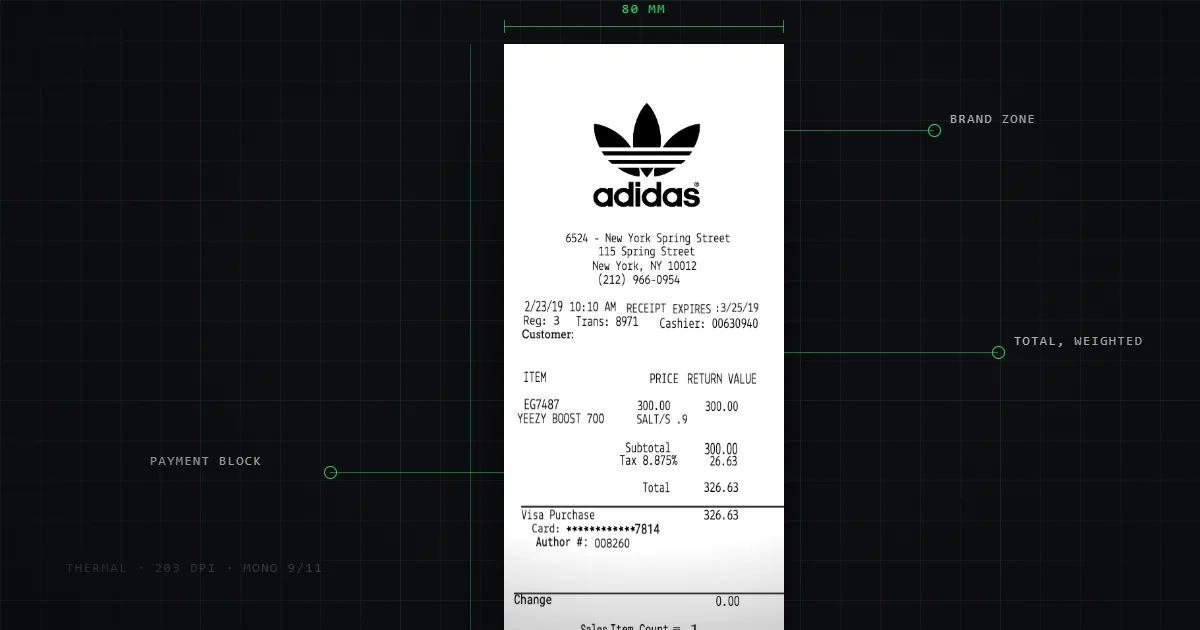
How receipts are actually designed
Most receipt design advice comes from printer makers. Here is what the layout of 632 real receipts shows: block order, widths, barcodes, thermal limits.
Search for receipt design guidance and nearly everything you find is published by a company that sells thermal printers. That doesn't make it wrong, but it does shape it: the advice tends to arrive at "buy better hardware and quality paper."
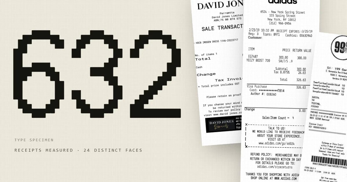
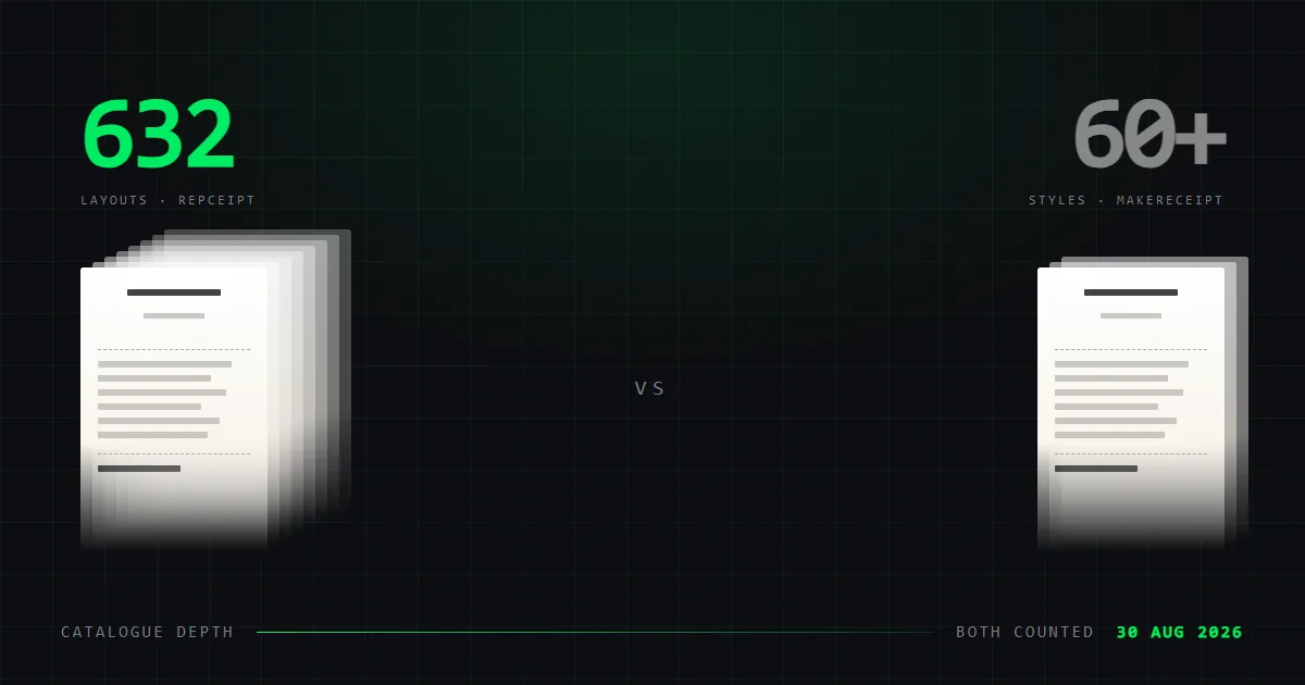
We sell no hardware. What we have is a library of 632 receipts redrawn from real documents, which means we can describe what receipts actually contain rather than what they ought to.
All figures below were measured on 16 August 2026. As with our typography analysis, we measured structure only — element types, counts and geometry — never the contents of any field, because these documents were rebuilt from real transactions.
The anatomy of a receipt
Across the library, the mean receipt carries 21.1 elements. They break down like this:
| Element | Total occurrences | Share of receipts carrying one |
|---|---|---|
| Text fields | 11,284 | ~all |
| Dividers | 1,194 | most |
| Logos | 364 | 52.8% |
| Barcodes | 248 | 37.3% |
| Date-and-time stamps | 124 | — |
| Images | 87 | — |
| Phone numbers | 37 | — |
| QR codes | 0 | 0.0% |
The dominance of plain text is total — 11,284 of roughly 13,300 elements. A receipt is a text document with a handful of ornaments, and the ornaments are mostly rules.
Those 1,194 dividers matter more than they look. A receipt has no boxes, no background colours, no indentation to speak of. The horizontal rule is essentially the only grouping device available, which is why a typical receipt uses two or three of them: header from items, items from totals, totals from footer. Divide with rules or don't divide at all.
The conventional order, which the library bears out:
- Store identity — name, often a logo, address, phone
- Transaction metadata — date, time, register, transaction number
- Rule
- Line items — description left, amount right
- Rule
- Totals — subtotal, tax, total
- Payment — method, masked card digits, change
- Rule
- Footer — returns policy, marketing, thanks
- Barcode, where present
Should a receipt be 80mm or 58mm wide?
Two paper widths dominate: 80mm for retail and restaurants, 58mm for compact counters, taxis and portable terminals.
The width isn't really about paper, it's about characters per line. At 80mm a typical printer gives you 42 to 48 characters of the standard face; at 58mm it's around 32. Those counts fall out of the built-in font metrics in Epson's ESC/POS command reference, which most receipt printers implement. That number governs the design more than anything else, because it decides how long an item description can be before it wraps — and a wrapped item description breaks the two-column alignment that makes the receipt readable.
If you're designing a layout, count characters, not millimetres.
Type
Covered properly in the typography article, but the design-relevant summary:
The tabular middle of a receipt is set in a monospaced face so that the right-hand amount column aligns without any layout engine computing positions. Fixed pitch is the alignment mechanism. Most POS printers ship two built-in faces, Font A and Font B at roughly 12×24 and 9×17 dots, and switching between them is how you get emphasis, since there is no bold in the usual sense.
Headers and footers are frequently proportional — nearly half our sample uses a non-monospaced face somewhere. The constraint binds the columns, not the whole document.
Barcodes, and the QR code that isn't there
37.3% of receipts carry a barcode. They're typically the transaction or return reference, printed so a till can scan the receipt back in rather than have a clerk retype a number. That's the whole purpose: barcodes on receipts exist to get the document back into the system.
Worth knowing for implementation: barcodes are usually rendered as type, not as images. Barcode fonts map characters to bar patterns, so the printer draws them through the same path as text. In our library the single most common typeface is a barcode font, on 35.1% of receipts.
0.0% carry a QR code. Not one in 632.
That is the most counterintuitive number we found. QR codes are on menus, posters, packaging and parking meters — but across this sample they had not reached the printed receipt. If you're designing a receipt and assuming a QR code is expected, nothing here supports that. The 1970s barcode is on more than a third; the QR code is on none.
Proportions
Receipts are tall, but the range is wider than the stereotype:
| Proportion | Share |
|---|---|
| Wide slip (under 1.4:1) | 2.1% |
| Short slip (1.4–2.2:1) | 11.7% |
| The usual tall receipt (2.2–3.2:1) | 63.8% |
| Long till roll (3.2–4.5:1) | 17.6% |
| Very long roll (4.5:1 and over) | 4.9% |
Median: exactly 3.00. Extremes: 0.36 to 6.30.
Nearly two-thirds sit in a narrow band around three times taller than wide. That's the shape people picture, and it's a reasonable default. But 4.9% run past 4.5:1 — usually itemised grocery shops — and a design that assumes a short slip will look wrong at that length. Design the header and footer so they still read when there are sixty line items between them.
Length has a running cost. At 80mm, every extra line is paper on every transaction forever. Marketing footers are where this gets away from people.
What thermal printing rules out
Direct thermal printing is a heating element against heat-sensitive paper. One colour, no ink, no ribbon. That forecloses a lot:
- No colour, and no useful greyscale. Halftoning a photo on a thermal head gives you mud. Logos need to be pure black-and-white line art, not a downsampled brand asset.
- No fine detail. Print heads are typically 203 dpi. Hairlines vanish and small type loses its counters.
- No bold in the typographic sense. Emphasis comes from switching to the larger built-in face, or double-strike.
- Nothing permanent. Thermal paper fades — months in a wallet, faster in heat or sunlight. This is a genuine design constraint: if the document needs to survive, it needs to exist somewhere else too.
The last one is why so many receipts now carry both a printed and an emailed form, and why photographing a receipt you care about is sensible.
Designing your own
Pulling it together:
- Start from characters per line — 42–48 at 80mm, ~32 at 58mm.
- Monospace the columns. Let fixed pitch align the amounts.
- Group with rules. They're the only grouping device you have.
- Three type sizes: store name, body, total.
- Line art logos only. No greyscale, no photographs.
- Keep it short. The median is 3:1 for a reason.
- Skip the QR code unless you have a specific reason. Nothing in 632 real receipts had one.
If you'd rather start from something real than from a blank canvas, our template library is 632 layouts redrawn from actual receipts, editable line by line.